AP Human Geography: The Geography of Religion in Your Town


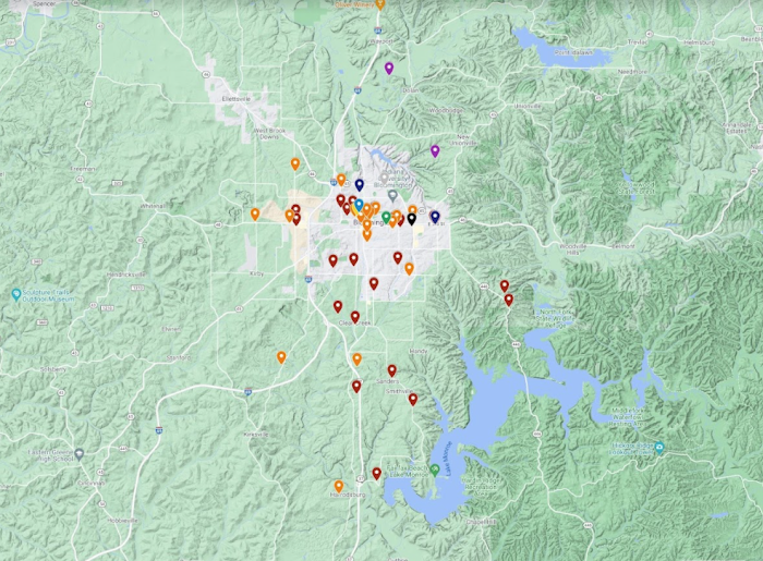
Here's an assignment that I gave Will for AP Human Geography, designed to get her exploring data and making her own connections:

OUR TOWN'S CHURCH MAP PROJECT


ASSIGNMENT: Map and analyze places of religious worship in our town.


  1. Use Google Maps to create your own map in which you pin every place of worship in our town.

    1. Use different colors or icons to differentiate the following:

      1. Each religion (Christian, Jewish, Hindu, etc.)

      2. Each denomination of the Christian religion (Catholic, Methodist, Anglican, etc.)

    2. Refer to Rubenstein ch. 6 to make sure you’re searching for all religious faiths.

  2. When your map is complete, use it to analyze the places of worship in our town. Use a combination of written analysis and graphs that you create. You should have at least five graphs or visual analyses, and at least one page of written analysis.

    1. You will come up with your own criteria for analysis, but some possibilities might include:

      1. the ratio of houses of worship to population numbers

      2. the ratio of numbers of houses of worship of different faiths to each other

      3. location trends that reveal dispersal of houses of worship of different faiths


This turned out to be a fun way to manipulate data, as well as a sneaky way to reinforce Will's understanding of the different religions and denominations for her AP Human Geography exam. 

Will's map was particularly interesting to me. For a long while I've had the idea that our area has a large evangelical population, and Will's map, in which she's labeled the evangelical churches with burgundy pins, seems to bear that out, although interestingly, the population of evangelical churches skews toward the south of town. I'd be curious to see the map stretched farther in all directions, actually, as to the east and west of town it's also pretty rural. Does a rural setting correlate to a larger evangelical church population?

Here's her ratio of religions in our town:

This pie chart was a good spot to show Will how the data can be expanded and contextualized with further information. For instance, the ratio of Buddhism might seem a little high, but some of the Dalai Lama's family live here, and there's an excellent Tibetan Mongolian Buddhist Cultural Center here. You can speculate, then, about how these pull factors might affect the ratio. 

If you were an AP Human Geography student, you could perhaps even write an essay on that topic!

After seeing Will's map, I'm not as surprised by her ratio of Christian denominations:
Can you see the artifact where she used the eraser tool on this graphic? She had to edit it because she'd accidentally typed "LSD"--oops!

Since Will is almost completely unfamiliar with organized religion (shame on me!), a very important component of the AP Human Geography exam, I thought that this project worked well to give her an understanding that hopefully felt a little more hands-on than just reading chapter 6 of Rubenstein. Not only does she have a sensorial understanding of what the map of our town represents, but we can also drive around and literally look at these buildings that we've driven past her whole life, or stop and walk around them, study the architecture, etc. 

To be honest, I don't know if this more personal type of project *really* helped make the concepts in chapter 6 less abstract for Will, but she DID score a 5 on her AP Human Geography exam, so there you go!

Older Post Newer Post