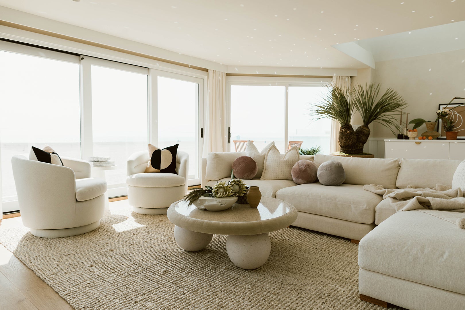
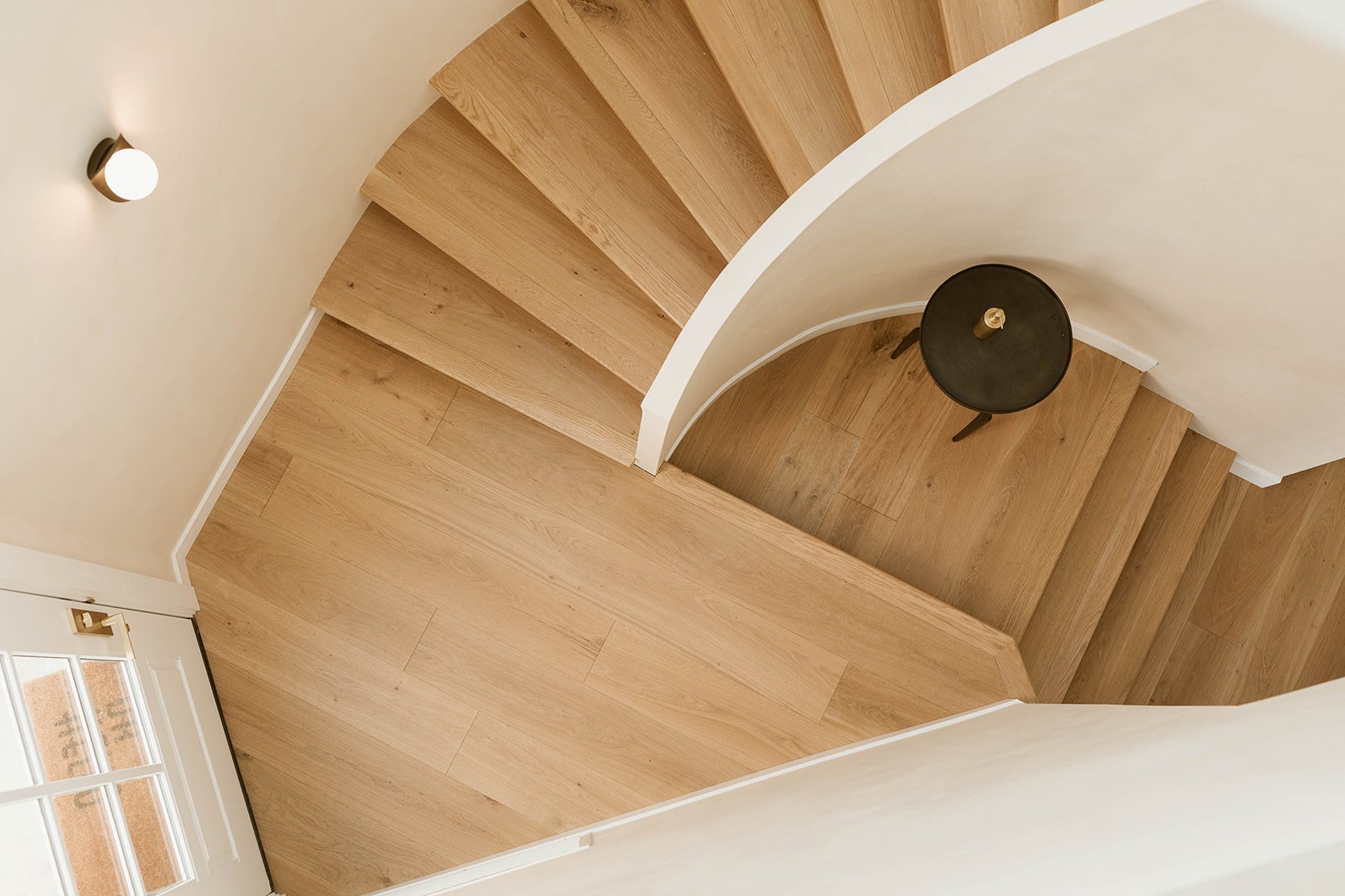
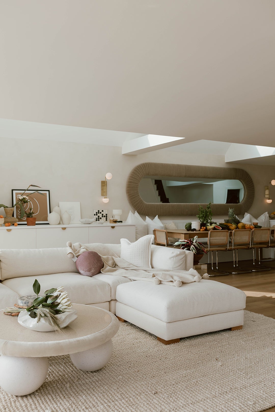
Much like the Pacific Coast Highway, which you’d have to drive along to get to this Ventura, California, property, the home’s interior is full of unexpected curves and turns. After a Los Angeles–based couple with two young kids bought the beachside property as a place to escape during the onset of the pandemic (it was the last oceanfront house available at the time), they brought in designer Jess Diab, former project manager to Sarah Sherman Samuel, to jazz up the space. “They were in bunker mode; they needed everything in this house,” recalls Diab. Inspired by the swooping entry stairwell, she committed to the circa-1980 home’s irregular shapes and compartmentalized social areas. “We wanted to celebrate the space’s geometry,” she says.
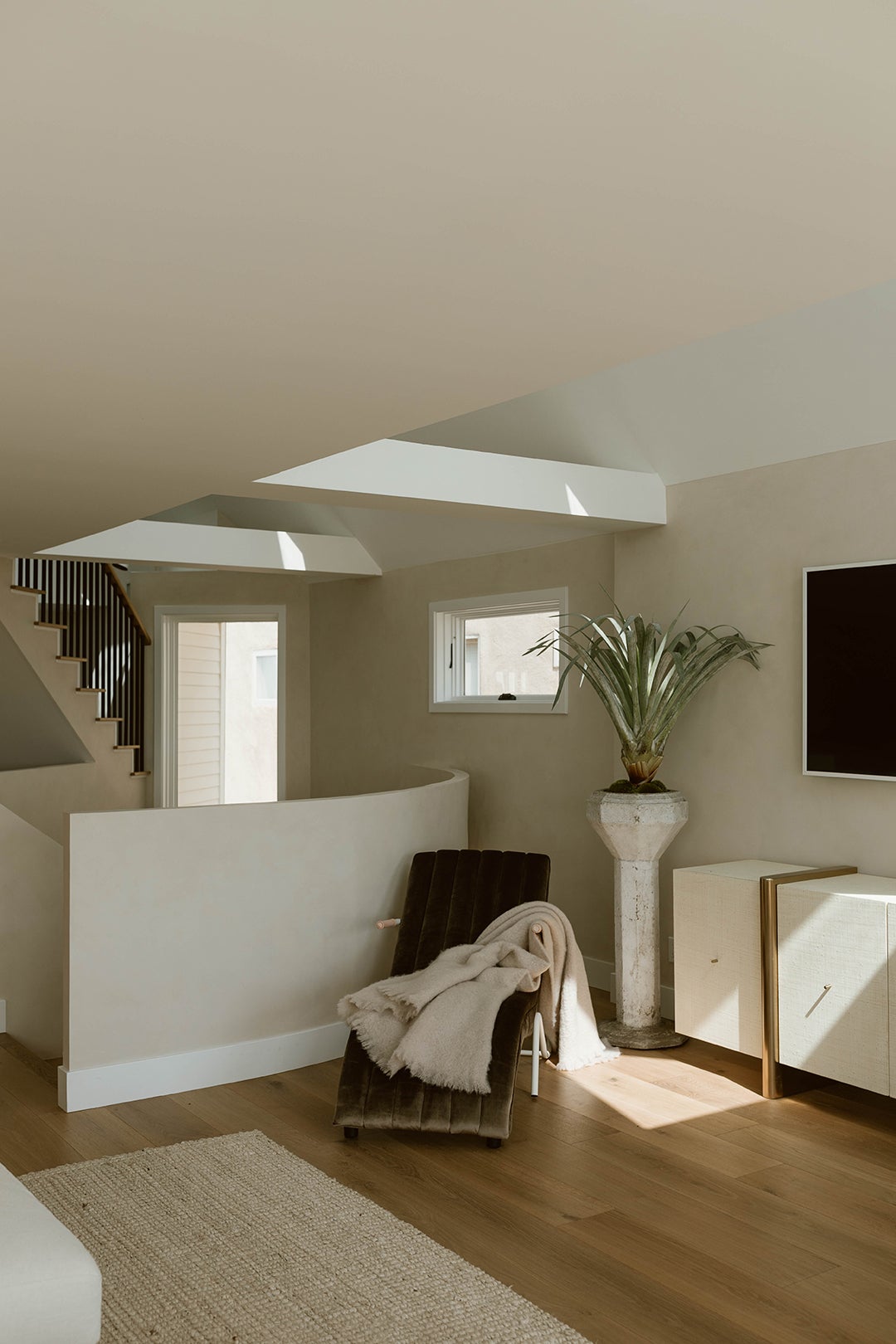
The challenge was to make the house feel less choppy without attempting structural changes. The home spans three floors, with the guest bedrooms on the lower level; the living, dining, and cooking zones on the middle floor; and the main bedroom in a partially open, lofted space. “It was very clunky,” notes Diab. “I didn’t want people who were moving through the house to feel like they were having an experience of just walking up and down a bunch of stairs.” The idea was to create as many moments and as much movement as possible to give the illusion of flow.
Coming in for a Landing
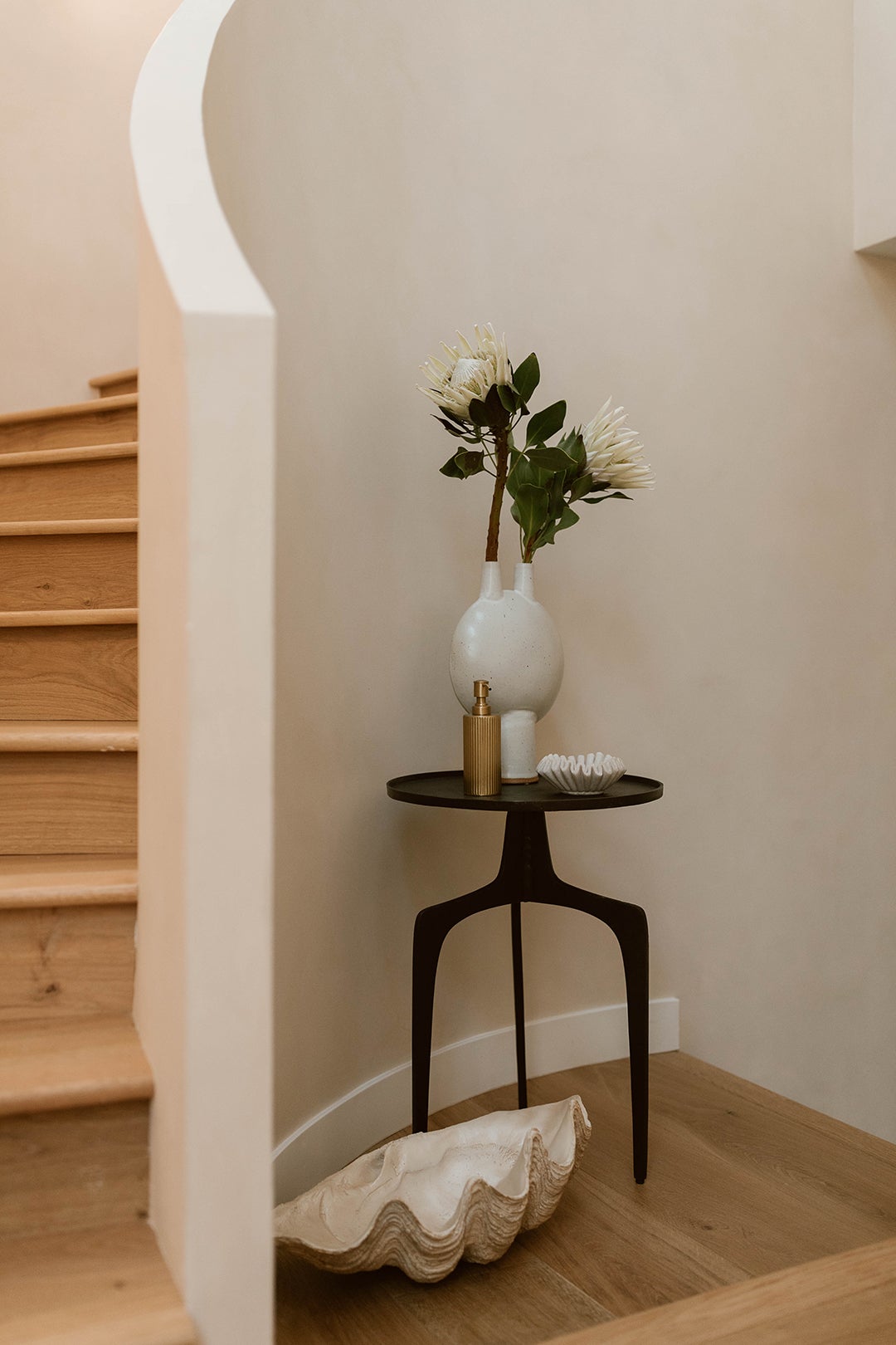
Diab took a fun approach to the funky stairwell niche by plastering the walls of the enclave for a soothing, textured touch and adding a sculptural side table and giant decorative clamshell. The vignette encourages a moment of pause before you head out the front door.
A Calm Wake-Up Call
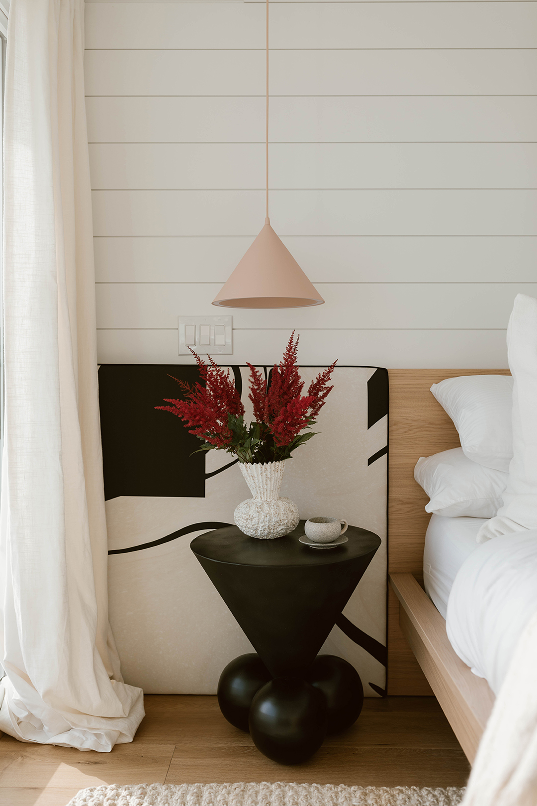
Because the guest bedrooms are located on the ground (er, beach) level, Diab sought to make those spaces feel like hotel suites by adding simple nightstands and pendant lights. “I initially started with the Drop It Modern fabric,” she shares, pointing to the custom cushioned panels that frame either side of the headboard. The graphic pattern inspired the side table, which looks almost like a 3D version of the print. “That black side table with the three balls at the bottom was a heinous black with gold feet that we got for around $100 off a random website,” recalls Diab. “We spray-painted it and now it looks like it’s $600.”
Before Diab got on the scene, the lofted bedroom looked like a bowling alley (it was just long and narrow). “The bed could really only go on that one wall,” she says. In an effort to make the awkward orientation less noticeable, she opted for a custom channel-tufted headboard to introduce some horizontal lines into the room.
On Edge
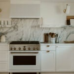
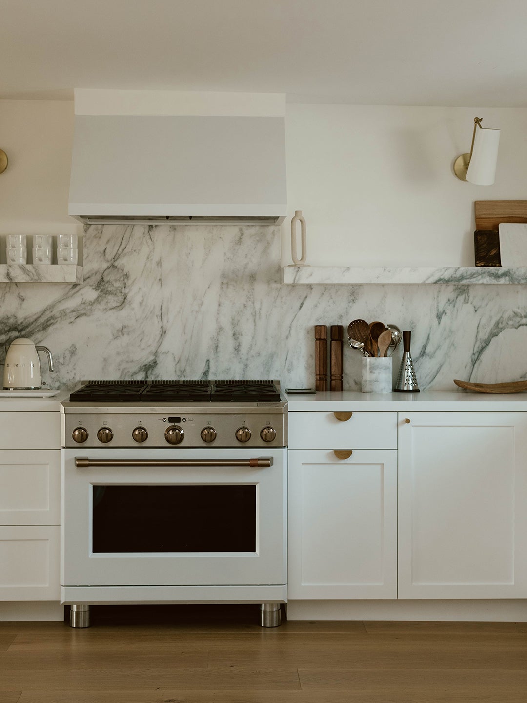
The new marble kitchen countertop and backsplash was a winner right away because its dark green and gray veining reminded Diab of the Pacific Ocean. “We worked with the slab yard to meticulously book-match all the visible edges of the shelves, so that it had the allure of swirling across the space in a watery effect,” she reveals. The upper shelf was created so that the clients’ guests could always see where the essentials (namely, the coffee grinds and mugs) are kept.
Storage Wars
Diab teamed up with pro organizer Julianna Strickland of Space Camp Organizing to not only stock the house with all of the family’s favorite snacks, but build out the necessary cabinets to hold their surplus kitchen things. Because the homeowners needed enough room to host at least 15 people, Strickland framed either side of the dining nook with extra storage for pantry items and dishes. Continuing the curved theme, she topped off the cupboards with Park Studio hardware (and did the same with the bedroom closets). “Working with Julianna was like ASMR,” says Diab with a laugh. “I felt like everything was going to be okay.” We feel soothed already.
The post Swooping Curves Create a Sense of Movement in This Once “Clunky” Beach Home appeared first on domino.

